

MIDDLE EAST, EUROPE & USA

CLIENT: EMAMI INTERNATIONAL DIVISION
BRAND: AYUCARE
Our client wanted to launch a range of Ayurvedic / natural toothpastes for their international markets – Europe, Middle East and North America. Their initial brief to us was to launch a new brand, but rather than go through the process of a new brand name registration, they eventually decided to use an existing brand name they owned which had a single product in a couple of geographies. The existing brand name was ‘Ayucare’ and the product was Neem toothpaste.
The objective was to design a completely new brand identity and develop packaging design for a range of five Ayurvedic / natural toothpastes. The challenge was to highlight the ingredients which supported the efficacy claims of each product, in a unique way that also celebrated traditional methods and the Indian heritage of Ayurveda. Each product had a different hero ingredient and the design route needed to weave these together into one style that would build shelf-presence for the entire range. In the absence of a large advertising budget, the packaging design needed to tell a credible story that educated the consumer and at the same time built an emotional connect with roots and traditions and thereby also with the product.

Our approach to any form of design project is the importance given to understanding the category through a process of due diligence and detailed research. In this instance, this gave the designers the opportunity to explore the ancient history of Ayurveda (Ayur means Life / Veda meaning Science / Knowledge) which is synonymous with the richness of Indian heritage and culture. The designers researched historical, authentic art forms from India, specially scenes of nature and life characterised across specific regions in India.
Following research, the areas for creative exploration were identified and design directions briefed to specific members of the Creative team in order to achieve a maximum bandwidth of design thinking and treatments to share with the client. The concept presentation consisted of three alternative directions :
Route 1. A development of the previous ingredient-led concept, the new design featured botanical-style etchings in gold of the lead ingredients suggesting an age-old expertise with contemporary typography styling.
Route 2. The concept showcases Ayurveda - 1000 years of traditional Indian medicine using an abundance of herbs. The design format created, reveals only a little detail and never the entire picture suggesting the hidden ancient knowledge seen in secret gardens created in the style of ancient Indian paintings.
Route 3. Inspired by colourful face-painting and masks from religious characters and images found in Indian culture and the variety of festivals, minimalistic patterns are used in the backgrounds resembling wall images.
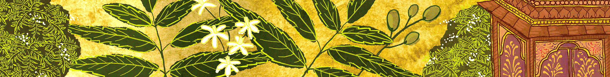
The chosen route (2) involved creating intricate illustrations of nature and life, with the main ingredient featured prominently, juxtaposed with architecture, clothing, and floral motifs. These are reminiscent of miniature paintings from ancient Rajasthan culture and heritage, and the Madhubani style of artwork. Each illustration was individually created and picks up on the colour tones of the featured ingredients ie; Spicy Red in dark earthy reds, Cinnamon on rich browns, Neem in dark olive green.


The Ayucare brand logotype was sensitively redesigned introducing characteristics which connect the rationale of both letterform and imagery together. The typeface is based on a bolder version of the Minna Drop that did not exist and needed to be created by the design team and is debossed on the final print production. This offers a good contrast between the cleaner, secondary san serif typeface being used, the layout is modern and well balanced to show the fusion of tradition and modern science.
The outcome was that we developed a brand identity and a set of packaging designs for 5 toothpastes. The brand identity speaks to the consumer about the powerful essence of Ayurveda through its depiction of ingredients within the framework of ancient medicine brought to life via the use of the style of miniature painting from Indian heritage. The earthy colours bring out natural cues while the dominant and solid use of black in the logo and the clean modern layout is a nod to science and therefore efficacy of the product.
This identity and design route is easily extendable to other categories within the health and beauty segment, which is what the client intends to do with introduction of other lines and sub-categories.
This is immensely valuable as the design lends itself easily to be visualised for range extensions – like skincare, health teas or even supplements, without being simplistic.
The greatest strength of this route is the bringing alive of Ayurveda which to some western audiences could at times feel a bit like mumbo-jumbo. It gives it a tangible context of time as well as beautiful illustrations to identify key ingredients that draw the consumer in while at the same time educating them.
The lesson both to ourselves and to others in the design industry is what goes into producing designs that truly respect multiculturalism. It would have been easy to develop a design that illustrated the ingredients, but that would not have highlighted provenance or recognised the power of Ayurveda as a respected form of ancient medicine or built a connection with consumers. It is only through in-depth research about ancient India, its richness of naturally healing and effective herbs, its art forms, and their use to depict daily life and then painstakingly creating these unique images that we can say we have delivered design that reflects in all ways what the product is, where it is from and what is it’s benefit. A complete story that every good packaging design should tell.

With globalisation as more and more brands cross geographical borders to meet consumers needs outside of their country of origin, agencies have to be sensitive to the roots of these brands and acknowledge them through design. Whether that is a subtle nod, or a complete treatment, will depend on several factors, but at its core it is important that designers understand the responsibility they have, and agencies provide the right multicultural environment and access to knowledge and insights, to create packaging designs that engage.
While it is early days for Ayucare, it is already evident that the brand is establishing great shelf presence and being identified as unique and a premium natural do-good product. It tells a great product story, which as the client had briefed, without a large advertising budget is what it was designed to do.

