UK
An impactful visual identity was needed to reflect the innovative digital service application created to connect locum radiographers directly with health care departments across the UK.
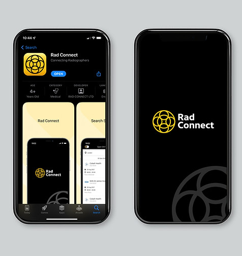
The Radiography Professionals Network named RAD CONNECT, targets radiography professionals and departmental / admin staff. The app will connect locums to available shifts in an effective and inexpensive way.

The Evolve team were briefed to create the identity which was easily identifiable by its target audience.
The overall objective for the company was to be the number one recruiting facility for radiologists and to replace old, outdated models with the use of innovative software which will be translated across both web and mobile devices. The brand core should project a professional yet understanding tone and give its users confidence and establish trust in the company.
Immediate research into exploring how to represent x- ray imaging, radio waves, machinery or even the film that the scans are printed on were areas of consideration and required an in depth understanding. The insights gained led the design thinking in several alternative directions and treatments.


A design that marries together science with a nod to the shape and movement of the MRI machine, the black of x-rays, and interlocking circles that suggest personal networking and connections. A simple yet strong logo, with a typeface that is both authoritative and approachable, to reinforce the tone of voice of the brand. A memorable design has been achieved by using strong contrasting colours, interestingly the yellow also has a link with the colour of the customary signages we see in and around radiology labs. Additionally yellow is known to help activate the memory, stimulate the nervous system, encourage communication, and build confidence. The same colour scheme runs across the Rad Connect website and the identity appears as the application button. The result is an identity which is versatile and dynamic.